Truck signage

Leafguy

New member
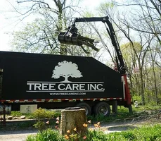
What is everyone put on there signs for you chipper truck?

Do you put up services provided? Which ones?

What Contact info? website? Email?

If you work in multiple towns and have a couple PH#, how many do you put up?

I'm about to redo my sign/logo and not sure what to all put on it. What's too much/What's too Little.

Thanks for any imput.
 
Be sure to include the area code. Most people have mobiles and they need to have the AC.

It's tempting to use all of the flat sides of the truck to advertise. Look at other service trucks that you see. How much info can you take away? Make sure that the phone number and website address are easy to read.

Pay close attention to color schemes and fonts and font sizes. Some fonts are too skinny to be clear. What looks good in print won't look right on the billboard.
 
I agree with Mister.

From a communication class a long time ago, the logo is very important for memory purposes.

Not a fan of wraps or tons of stuff on the truck. It gets distracting. Hit you over the head advertising. Makes me think I am being swindled for some reason.
 
Logo and phone #

Logo larger than the number

However I think people seeing your truck is going to search the logo/name and not the number (on their phone). Develop a good logo that people can remember.

Skip all the services you do...save it for your website.

Logo...Logo...Logo

Just my opinion
 
Good info.

I like the keep it simple theory as well. Logo/PH#/website was what I was thinking. I know some guys put things on like Ptuning/Removals/Planting or Insured. Not sure how well that works as I've never had a real big sign in the past. No space. I alway get compliments on the logo, so I'll keep utilizing that.
 
How does the name of your company reflect what you do? I look at signage on the truck as branding. It's not a sales tool but a marketing tool to create presence in the marketplace and reinforce brand recognition. Your company name and logo ph# and website.

I have had people drive up to us on the road and take down our name and number. Keep it simple and easy to read.
 
Consistancy, make everything the same.

Nothing worse then something different on your cards, shirts, trucks, etc.

I feel people will remember the logo if it's catchy enough.

I just redid my logo, for four years the font was to skinny to read. I put my new cards on the community board and they surely stand out.

Good luck.
 
We use the logo and web address only on our trucks. We cover a large area and one phone number would commit us to a smaller area. We have done this for about 3 years and it seems to work fine.

318962-018%282%29.JPG
 

Attachments

  • 318962-018(2).webp
    318962-018(2).webp
    104.1 KB · Views: 34

New threads New posts

Back
Top Bottom